
EdTech Learning Player
From legacy desktop player to multi-device learning
Open Dicussion

Poll

Before redesigning, we aligned on how learning should work in live classrooms:
STRATEGY & FOUNDATIONS
From Legacy Architecture to Responsive Learning
How we
Worked
Working closely with product, LXDs, and pedagogy, we navigated technical debt and tight timelines through pragmatic trade-offs.
Design
Principles
USERS & PAIN POINTS
Bridging the Gap for Teachers and Students
Both user groups required speed and reliability, but the legacy player simply wasn’t ready for real-time learning.


THE PROBLEM
System Fragmentation
CET’s ecosystem relied on incompatible systems for authoring and playback. This created a widening gap between content creation and multi-device consumption.
Structural Redundancy: Overlapping legacy patterns that hindered real-time, versatile learning.
Inconsistent Logic: Fragmented mental models that failed to scale across diverse learning contexts.
Rigid Architecture: A desktop-centric foundation that couldn't support a unified responsive experience
SOLUTION ARCHITECTURE
Adapting for Mobile Reality
Three Strategic Moves:
Mobile-first, no rewrites:
Reshaped content delivery for small screens while accepting legacy structural constraints.
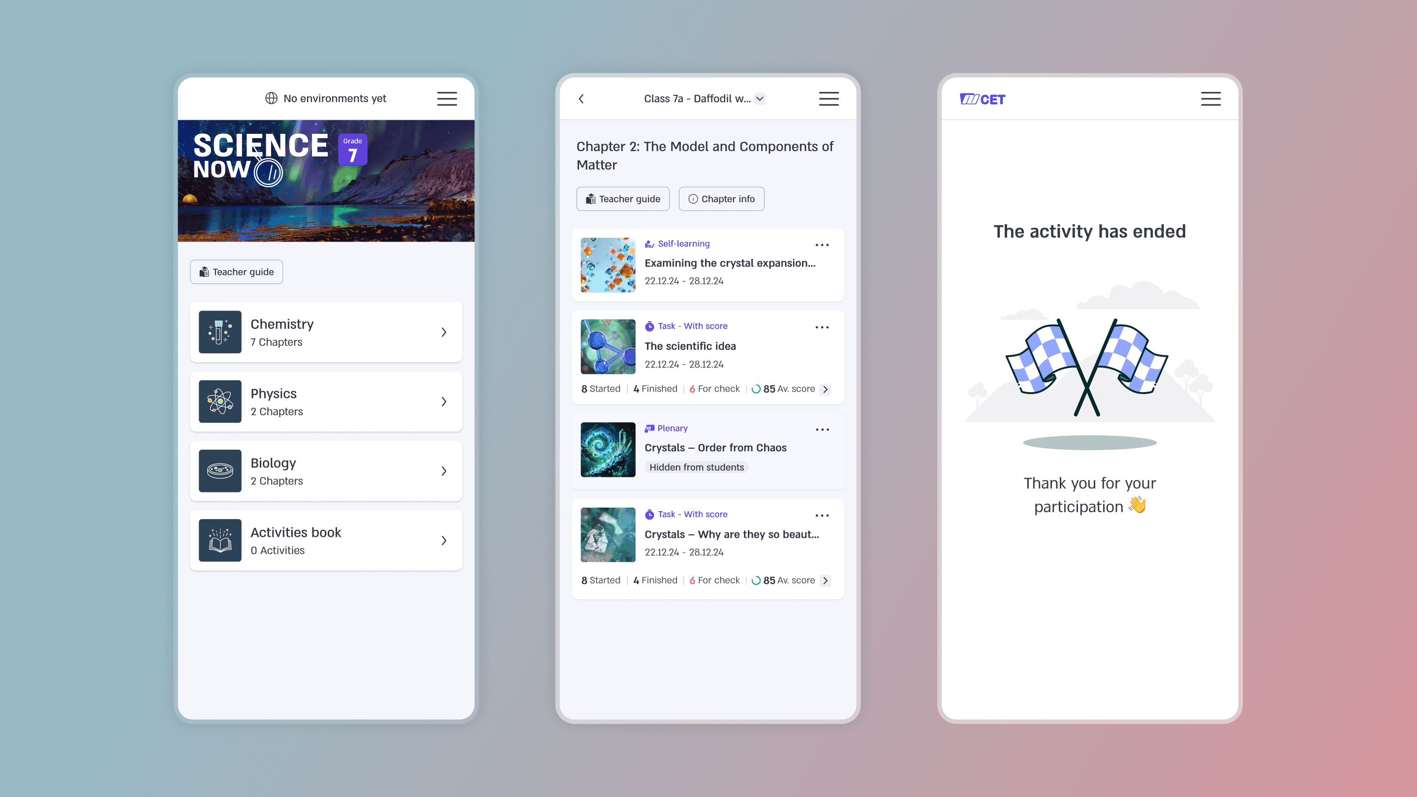
Classroom participation:
Optimized quizzes and polls for the devices students already had, enabling real-time collaboration.
Intentional trade-offs:
Prioritized reliability over desktop feature parity, removing complex, fragile interactions.


IMPACT
From Legacy Playback to Live Interaction
The new Player launched at the beginning of the school year, transforming the mobile device from a limitation into a primary tool for participation.
Frictionless Completion
Achieved 100% activity completion on mobile, eliminating forced device-switching and broken flows.
Live Classroom Synergy
Enabled real-time participation (polls, quizzes, discussions) on the devices students actually own.
Systemic Scalability
Established universal translation rules that allow for future evolution without rewriting existing content.
Operational Efficiency
Reduced long-term maintenance costs and technical debt by unifying the playback logic.

Next Project
